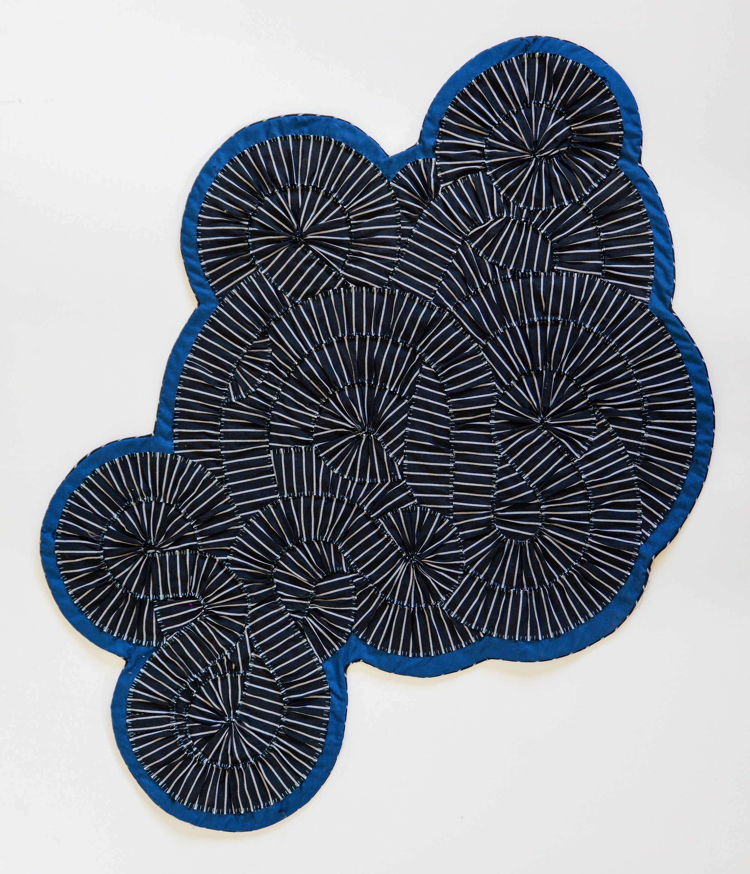
I created Deep Sea Spike using the same technique I developed in Sun Wobbles, pushed quite a bit further. I sought to understand the limits of the fabric’s flexibility, and the graphic possibilities when using a single, high-contrast fabric. The resulting quilt is very full, very noisy, almost difficult to look at. The strobing of the white and black lines make difficult to understand the underlying pattern through the visual cacophony.
I take pleasure in creating things that are difficult to look at, that play tricks on the eyes. As a person who gets migraines, visual strobing is a common phenomenon in my life, so there is an intimacy in sharing that experience with viewers.
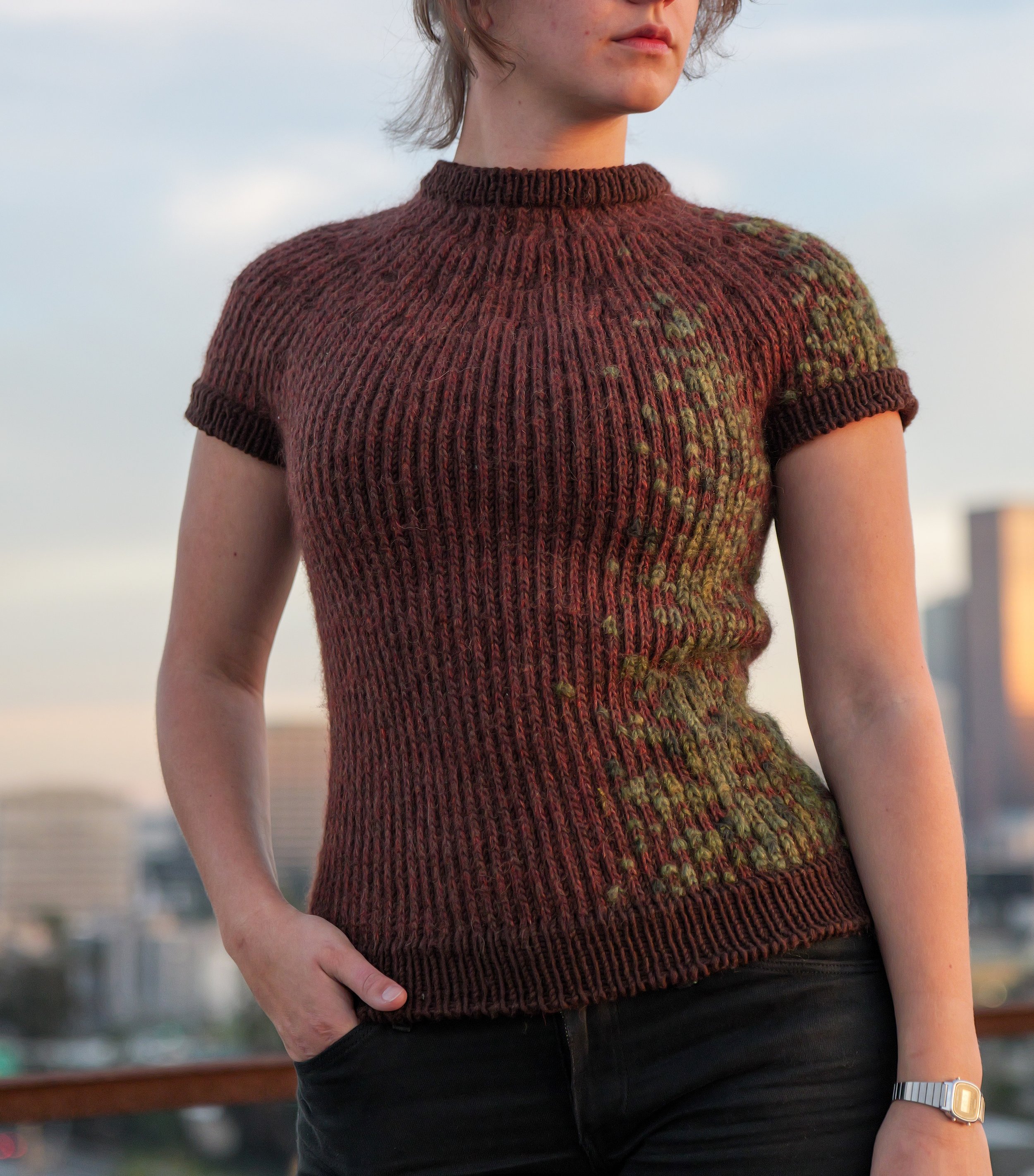
This piece was inspired by a roadtrip up the coast of California, where I was stunned by the sheer scale of the nature on this side of the country. The ridges in each tree were so distinct, so sculptural, that the association with a ribbed knit sweater were immediate.
The sweater is knit in two color jacquard – I used the Branch Jumper pattern by Odd Row for the basic shape. The moss was woven in after the sweater was completed, using a double stitch technique.
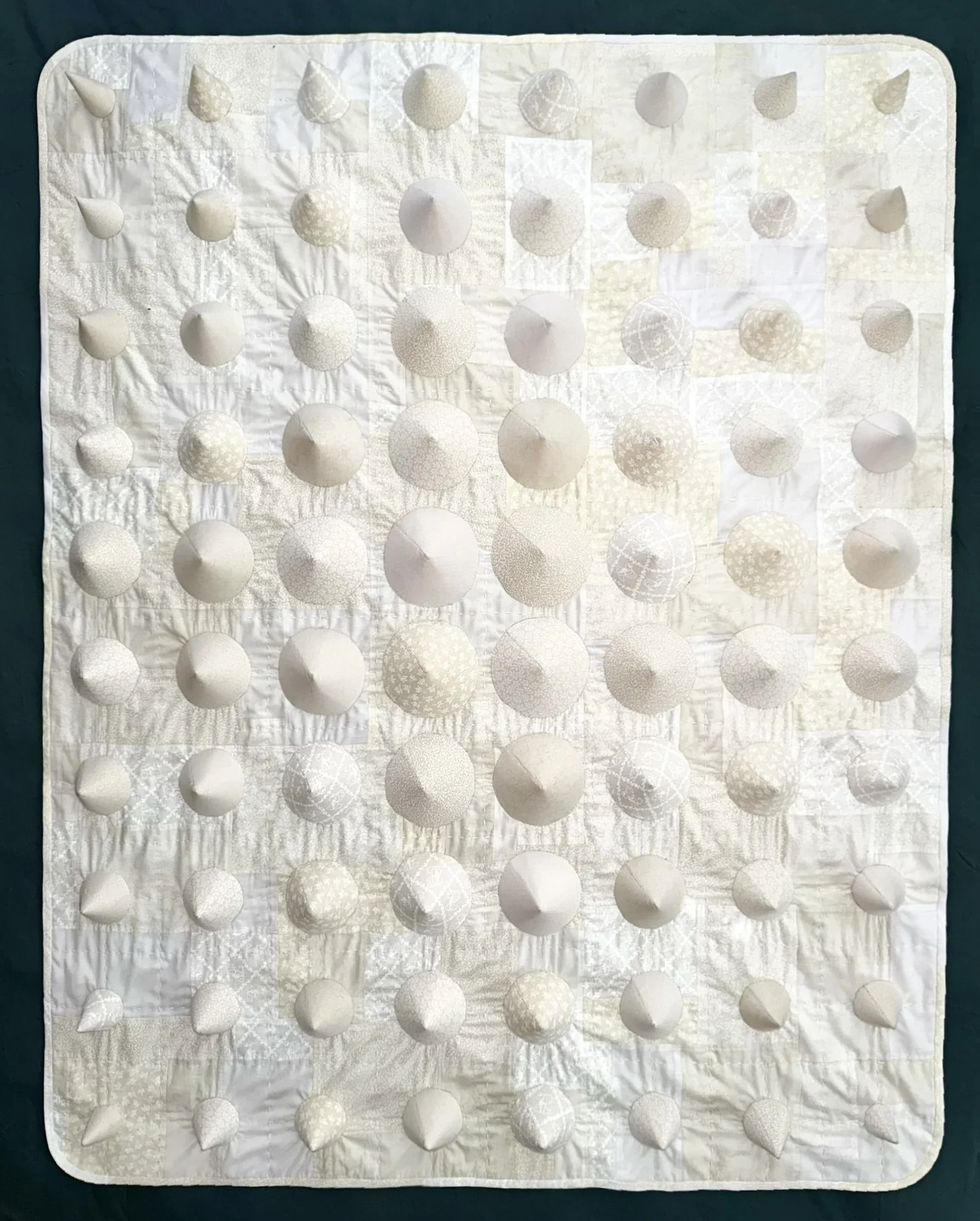
Out of the Ether came to me in a dream. I was small – mouse sized – and exploring a terrain made of white cones – each a different size and texture, each smooth and monumental. When needle actually hit fabric, certain concessions had to be made.
I mapped out the cone layout using increments of 30º – the cones in the corner are made from a 90º wedge, the next ones in are 120º , etc.. Each cone was sewn by hand and attached as appliqué to the base layer.
In certain lights, the cones seem to levitate off the surface, leaving the jogakbo-inspired backdrop in their wake. The contrast of smoothness and roughness, rounded edges and hard lines, heaviness and lightness create a piece that is tempting to touch, and heavy on the body.
Also, I’ve never seen a 3D quilt before, so maybe this is the first one ever. Let’s all just agree that it is.
Everything I Own was created in response “Who are you? Show, don’t tell.”
I wanted to create something that was honest, by nature – that left no place to hide. What would it look like if you invited someone into your home and allowed them to look in all the crevices? How would it change they way they saw you? What objects might stick in their mind?
I gave myself the option to not include something, on the condition that I had to immediately put it in the giveaway pile. I had to own the things I owned, and accept whatever may come.
The pleasure in collage lies in the inherent restriction of the medium. When you use one side of the page, you sacrifice the other. You can’t will the figure to be bigger or smaller, or facing another direction. (Those who make digital collages, this is not the space for you).
I almost exclusively use collage to make postcards for friends (the size limitation is yet another restricting factor). The process of creating something small and immediately sending it out has allowed me to work through ideas quickly – there is no preciousness, or sense of “series.” I create small visual stories, matched to the recipient.
However, mailing out my collages means not knowing where many of them ended up. So, reader, just imagine that there are a dozen more collages on this page that absolutely blow your mind.
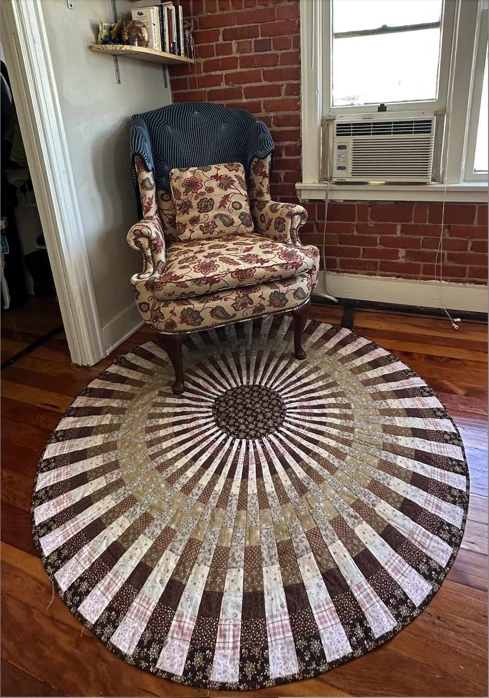
The Radial Quilt is the result of experimentation – I didn’t even really intend the quilt to be round.
I started by arranging my strips in a gradient, and creating a long sheet of striped fabric. I then used some simple geometry to cut even wedge shapes throughout, alternating the tilt of every cut. I turned alternating edges inward, and ended up with fabric optical illusion – a pulsing portal. The pattern has patterns within itself, rings of color rising out of the larger image.
I love that this quilt is both easy to make and highly visually impactful. It’s a sort of reminder that I don’t always have to make things hard for myself, I don’t always have to “suffer for my art.” Sometimes, getting loose and playing can have better results than hours of meticulous cutting and sewing. Sometimes.
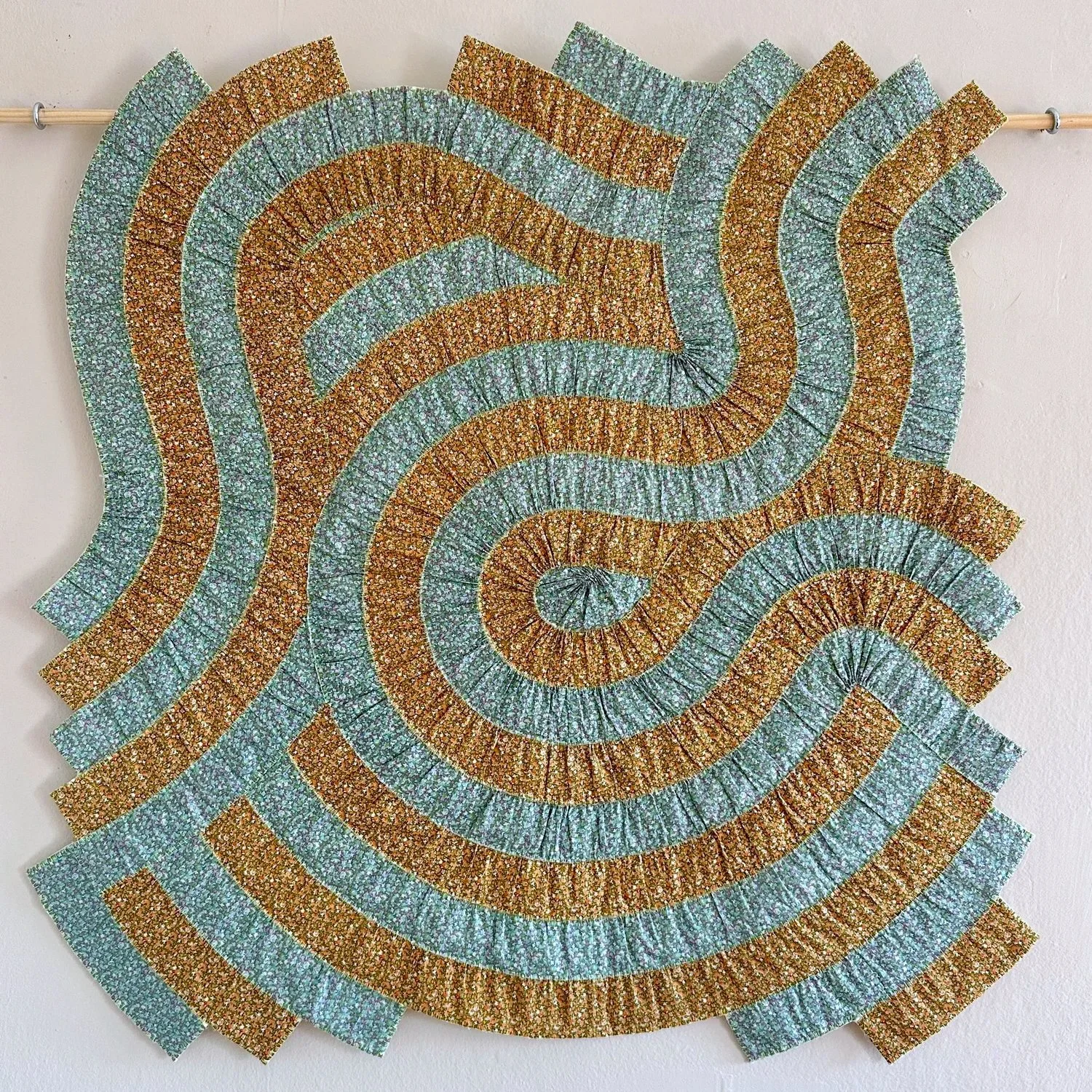
Sun Wobbles started with a gifted box of vintage Liberty fabrics. They were almost too beautiful to cut – I wanted so badly to honor these fabrics that I let them collect dust in my closet.
My fiber arts practice is materials-driven – I wait until a fabric reveals what it would like to be. These two specific fabrics simply couldn’t be separated as they evoked the same scene (A garden? A coral reef?) viewed in light and in shadow. I found myself cutting long strips in order to maintain the integrity of the pattern, and gathering them into a manipulatable, almost fluid state. I drew an initial curve on a piece of muslin in pencil, and gently suggested the fabric follow it. The process was organic, and an exercise in relinquishing control – there was a limit to how much the fabric would bend.
What emerged was an undulating scene, reminiscent of light on water, rolling hills late in the day, topographical maps. Initially, I planned to quilt it on the machine, but it felt quite violent to crush these gentle curves with the harsh lines of a zig-zag stitch. A single neon thread felt appropriate. It added a subtle glow to the piece, and, as a happy byproduct, made the back look very cool.
Every step of this process was defined by this fabric – the desire not to waste it, the limits of its malleability, and its tendency to fray. I look forward to receiving my next set of instructions.
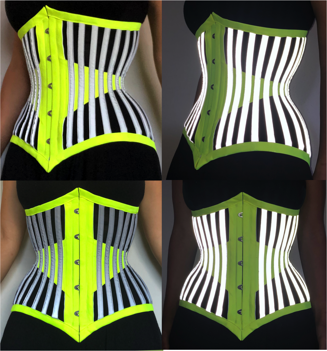
If a migraine was a corset, this would be it.
Constructed from 3M branded hi-visibility fabric, this corset could genuinely function as a safety garment. I was drawn to the effect of flash photography on reflective garments – the resulting image is darkened, obscuring the details of the wearer (there was a wave of “anti paparazzi garments” a few years back).
I loved the conceptual interplay of an un-photographable garment being lingerie. The idea that you could be wearing something very revealing (no telling what one might have on top and bottom) but have it be for the eyes only, visible only in a present moment.
This corset was made using a pattern by Aranea Black.
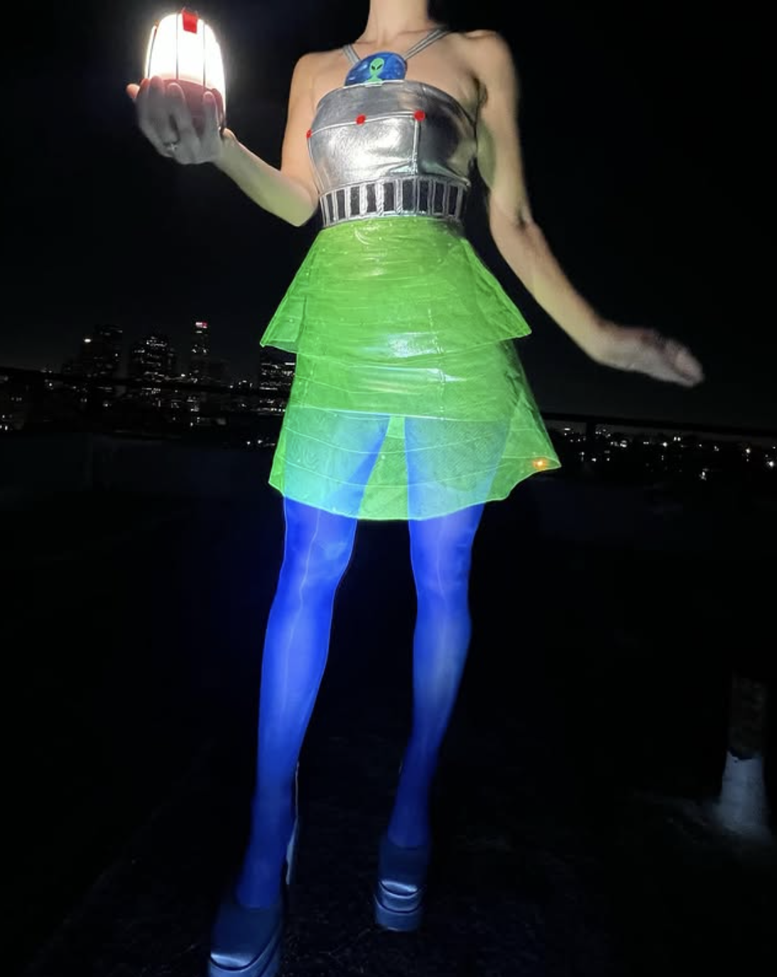
When creating halloween costumes, I always look first to the shape of the body – where do the natural lines flow, what geometry do their suggest?
From a legibility standpoint, the UFO is an absolute dream of a starting-off point. The imagery is so distinctive, so recognizable, that even a slight nod in its direction would communicate its meaning.
The peplum skirt as a tractor beam, the halter top as the ship’s antennae, the bust points as the ship’s lights – these were all a product of looking at the shapes of a UFO, and finding garment references that matched, rather than trying to force one shape onto another.
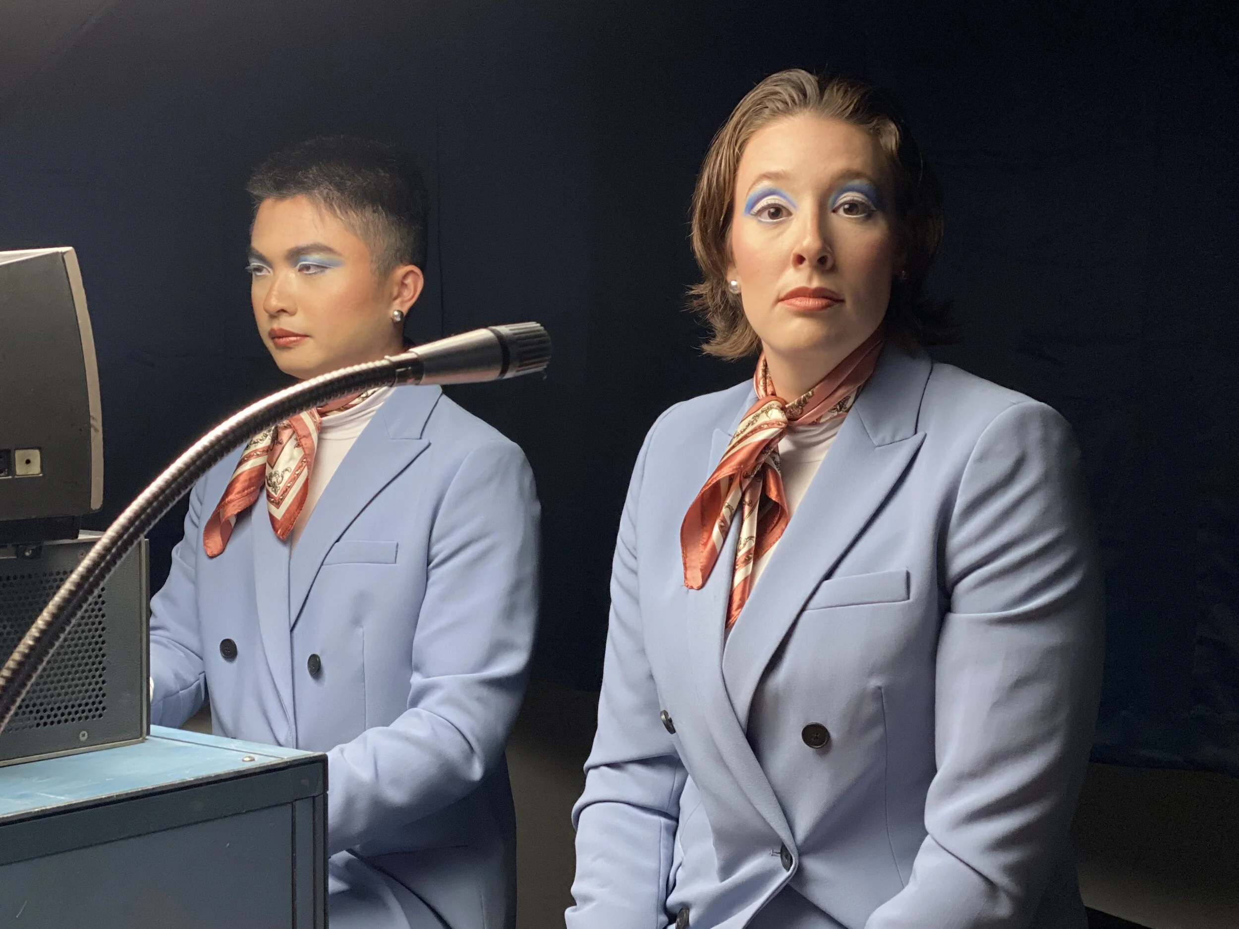
The music video for Virtual Love by Alphanaut was such a rich starting point for a costume designer – the idea of “first man” and “first woman,” and how they grow towards each other, the retro-futuristic scientists, experimenting with the world they’ve created. I wanted the real world and the virtual one to look completely distinct.
Ben Klebanoff, our director, was extremely receptive to big ideas – he loves bright colors, interesting lines, and bold makeup looks. Despite limited time and budget, we were both trilled with the final product.
Directed by Ben Klebanoff
Entitled “Watermelon,” this piece was a remount of a dance originally performed in the 1980s. As scenic lead, I referred to archive images from the performance, and updated the design to fit the current directors needs.
The watermelon itself was a large inflatable exercise ball with a canvas cover, painted while dangling from the ceiling of the scene shop. Imagine Michelangelo painting the Sistine Chapel laying his back, except its me and everything is green.
Photos by Sally Asher
Built on a modified Tudor silhouette, I designed this corset to emphasize the shine of the satin – how it’s character changes depending on the direction of light. I hand-pleated the fabric, and created continuity across each seam.
What I wouldn’t give for every corset to be a Tudor Corset.
The silhouette is so distinctive and gorgeous on the body, but the construction is quite simple. Two pattern pieces and straight boning channels make for fast sewing, and give your selected fabric plenty of room to shine.
This corset features hand embroidered eyelets and aglets, and includes more than 30 steel bones.
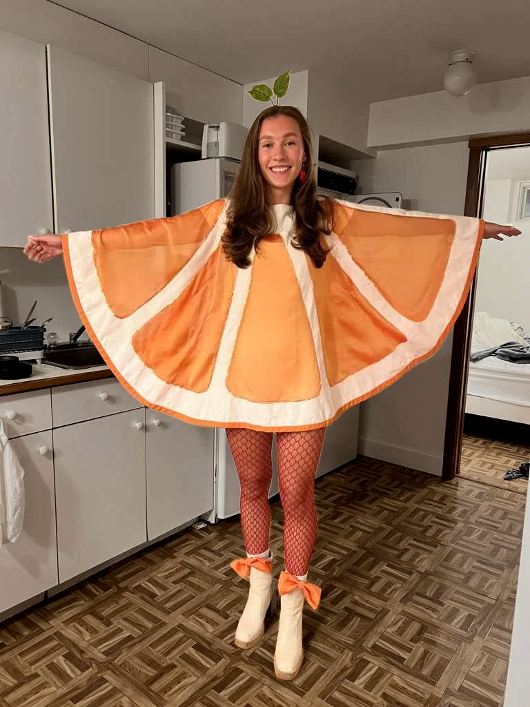
This costume was inspired by a 1960’s Jiffy Tablecloth Dress Pattern – I was so enamored with the shape of the dress, it was just a matter of finding a semicircular object that would be interesting to look at on the body.
The resulting garment is very fun to wear – it’s flattering without being fitted, and to get the full effect of the look, it’s necessary to strike a specific pose.
The earrings are tiny bags of oranges (pompoms, stuffed into a garlic bag from the grocery store), and the red fishnet tights reference the typical red net that oranges come in. Not pictured: a little purse that is also a bag of oranges.
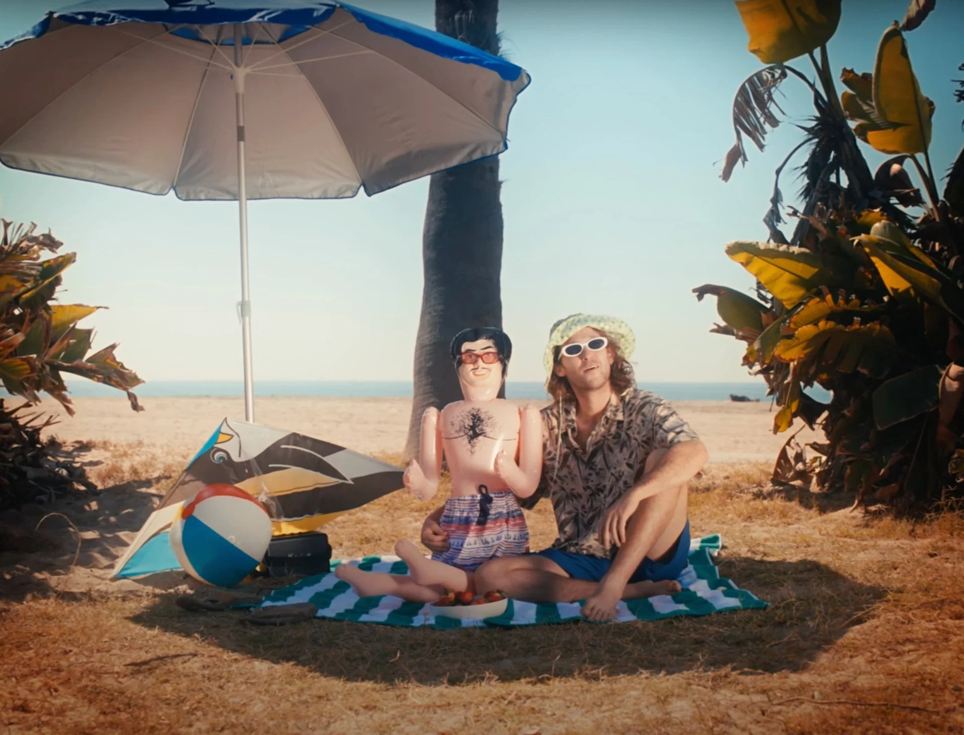
Have you ever dressed a blow up doll? No? Well, let me explain it.
They’re very small – children’s clothing upsettingly fits them best – and if the clothes are too heavy, they deflate under the weight of the garments. Their arms lack mobility, making it hard to get their limbs into the legs and sleeves. I guess they weren’t designed to be dressed.
When Ben came to me with his video concept, I was so thrilled, as always, by his strong creative vision and specific references. I love that he’s willing to take risks, visually, and that he trusts his designers to bring new ideas to the table.
I especially enjoyed dressing Ben and his husband “over the years” – aging them up or down with specific garment choices.
I styled this music video using entirely pre-owned garments.
Directed by Maria Belafonte & Ben Klebanoff
I’ve been knitting and crocheting for almost 20 years, and because of this, I’m quite fluent in the process – I can improvise, and make things up as I go. I enjoy the process of discovery that comes with creating something from a mental image, rather than a written pattern.
Feeling dissatisfied with most available “going out tops” I wanted to create garments that were unique, well-fitted, and could be work in a variety of contexts. I used classic cotton crochet thread (second hand, of course), along with various hardware notions.
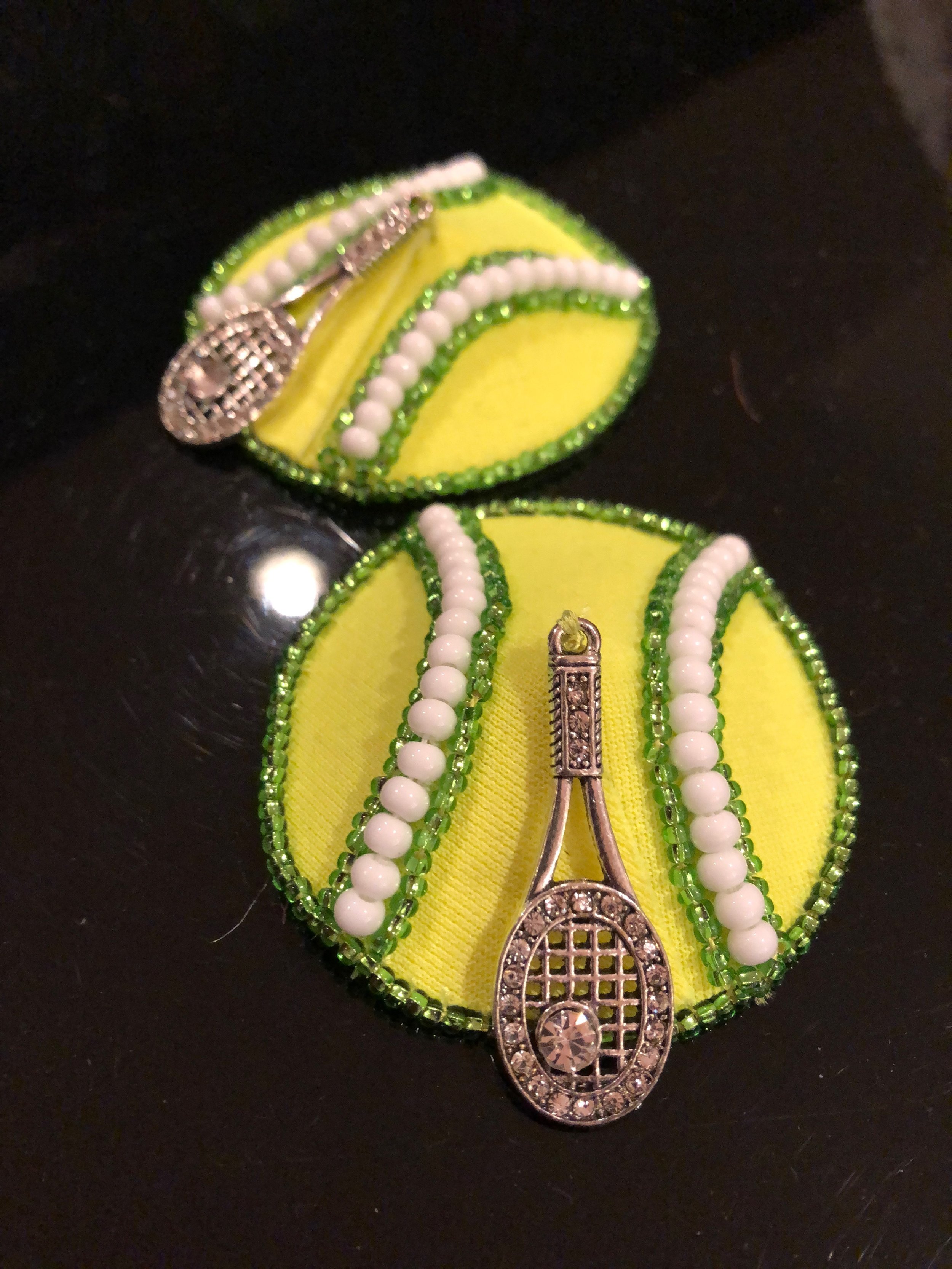
Pasties are the perfect canvas.
They’re small enough that you are forced to make strong design choices, and you can finish a pair in a few hours. However, they’re also always the, ahem, center of attention on stage, so you never have to worry about your work not being noticed.
I work closely with burlesque performers to create garments (would you call this a garment?) that fit within the larger theme of their number. I love working with enthusiastic weirdos with a strong vision and big dreams for their smallest accessory.
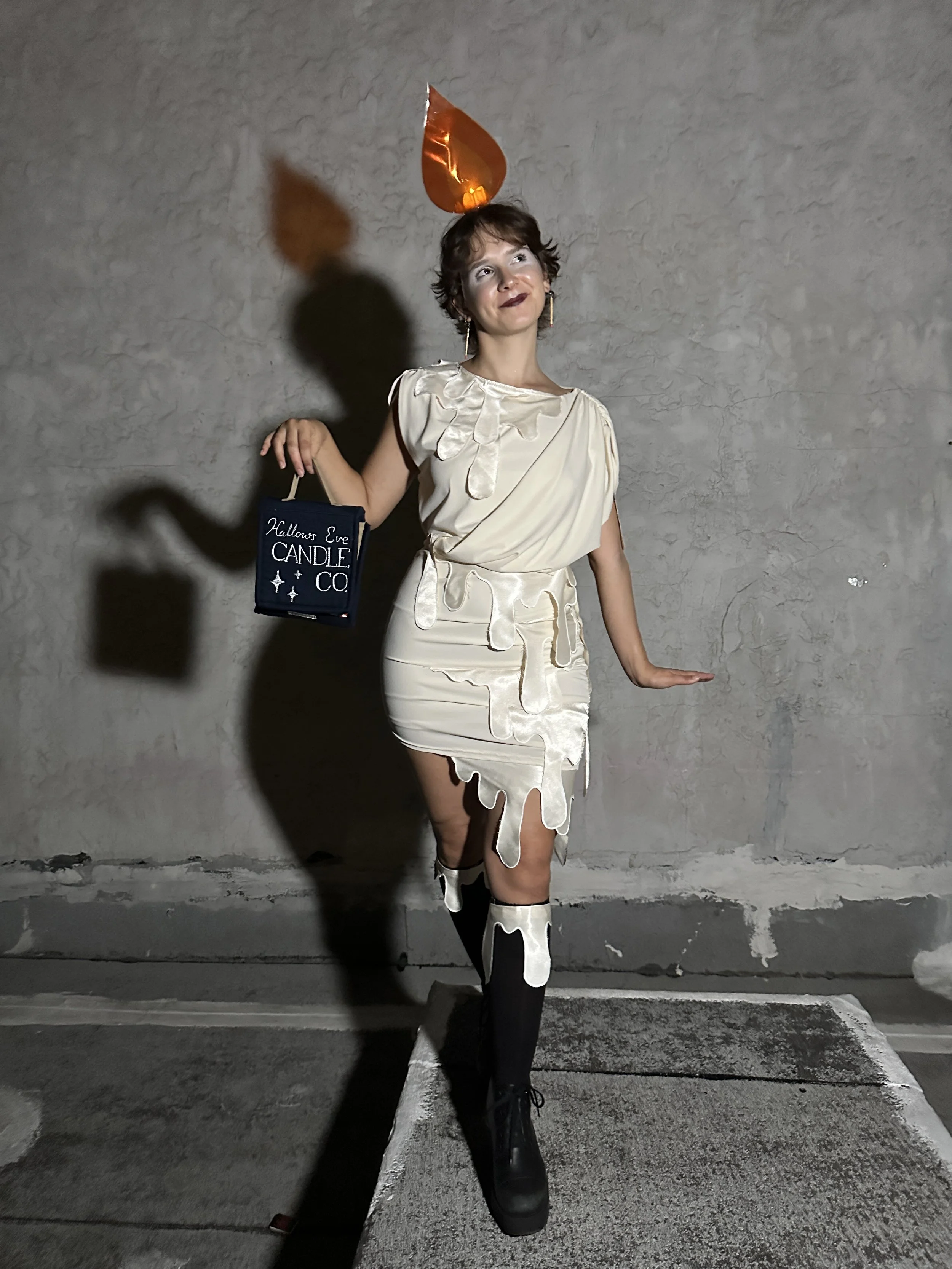
The flame actually flickers. The earrings are matchsticks. The purse is a little matchbook. What more can you ask for, really?
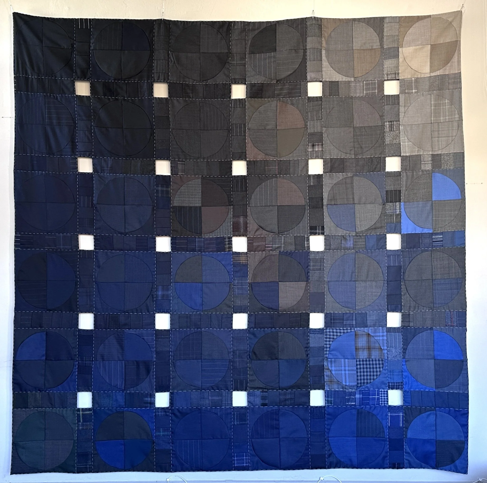
Each season, high end tailoring houses receive swatch books from various fabric suppliers. There’s usually about 100 swatches per book, and each swatch is ~6”x8”, usually grouped by usage or fabric content. These wools are expensive – hundreds of dollars a yard – but the expectation is that when a new books arrive, the old books are discarded.
I reached out to some tailors I’d worked with and asked them to set aside these books for me and quickly amassed quite a collection. The fabrics are very forgiving (suiting wools are quite flexible), but also very fussy due to being small. Hence: Night Vision.
This project started as many of my projects do – by creating a gradient. The flexible fabric practically begged to be sewn on a curve, so I listened.
Along with the larger swatch books, I also received tons of sheets of mini swatches – about 2” wide, between 1 and 3” long. These became the joining strips between the circular panels. I kept struggling with how to fill the “dead” squares between the panels (Use a contrasting color? Try to continue the gradient?), so decided to avoid it entirely. The white squares from this quilt go straight through to the back. If one submits to the idea that the line between art and craft lies in functionality, this is absolutely an art quilt – with all the holes, it’s just not very warm.
This quilt was shown at QuiltCon 2025 in Phoenix, AZ.
Styling for friends is always an interesting experience. On the negative side, it can be difficult to navigate the edges between the personal relationship and the professional one. On the positive, however, dressing those who are close to you has a very specific joy tied into it.
Lily came to me with a bright, joyful vision with a lot of color and depth. It was such a rewarding thing to know the people I was dressing intimately, and see them in silhouettes I’d always imagined would look great.
Directed by AJ Prager
Embroidery was one of my first loves, and like a first love, I often find it a bit tedious these days.
I initially started by recreating images in thread. While this is fun in it’s own way, I never felt like embroidering was adding anything to the piece – it was just a slightly wobblier line drawing.
When I started using french knots as a stippling technique, the works began to feel like their own thing, something that couldn’t quite be recreated on pen and paper.
Frankenstein was a site-specific theater piece adapted from the Mary Shelley novel, directed by Christopher Givens. I created the costumes with minimal shop support over a 3 week period.
The Creature’s bodysuit was made with non-conventional materials and techniques, making extensive use of liquid latex, layered with cotton pads, synthetic yarn, acrylic paint, and plastic grapes, as well as couched leather cording to create the illusion of stitched wounded skin.
Director: Christopher Givens
Lighting Design: Jasmine Williams
Photos by Blake Bertuccelli
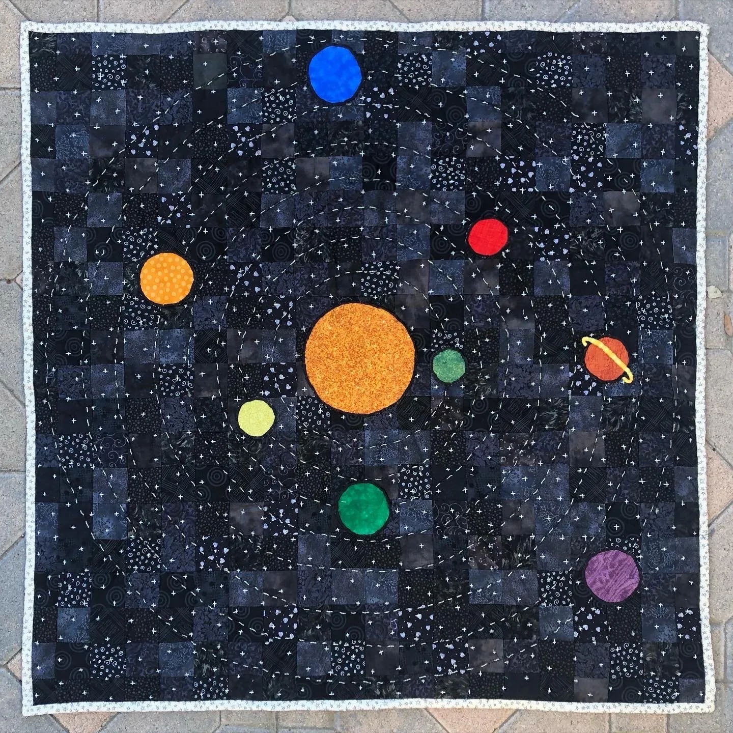
As a quilter, when your first friend has a baby, the game is on.
I knew my friend intended to raise their baby in a genderless way, so I chose imagery that isn’t associated with either “boy things” or “girl things.” What could be less gendered than the infinite depth of space?
By creating a grid of black fabrics (rather than one large piece) for the sky, I created a depth that suggest far-off galaxies. The clouds, well, the clouds are very cute. If, one day, my friends child becomes an astrophysicist, they’ll have me to thank.
As always, this quilt was made with secondhand materials.
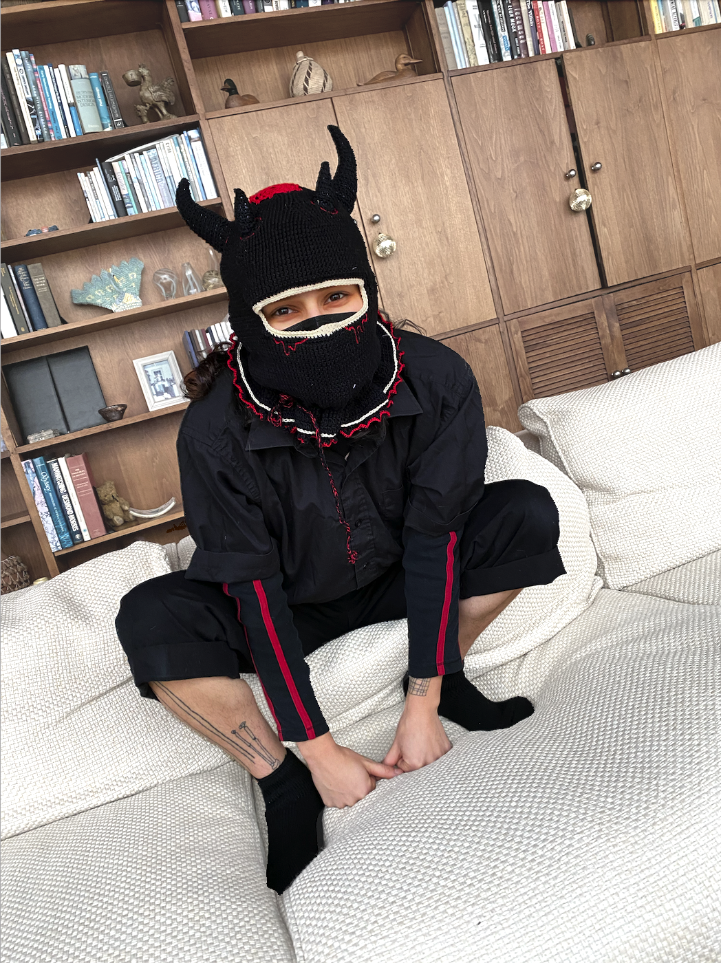
Does anyone else remember that period a few years ago when everyone was making balaclavas? It seemed like every knitter and crocheter in the world had their own take on the medium: this is mine.
This balaclava and it’s embellishments were crocheted freehand, using cotton thread. The drawstring in the neck creates a secondary ruffle in the garment – this demon isn’t just warm, he’s fancy.
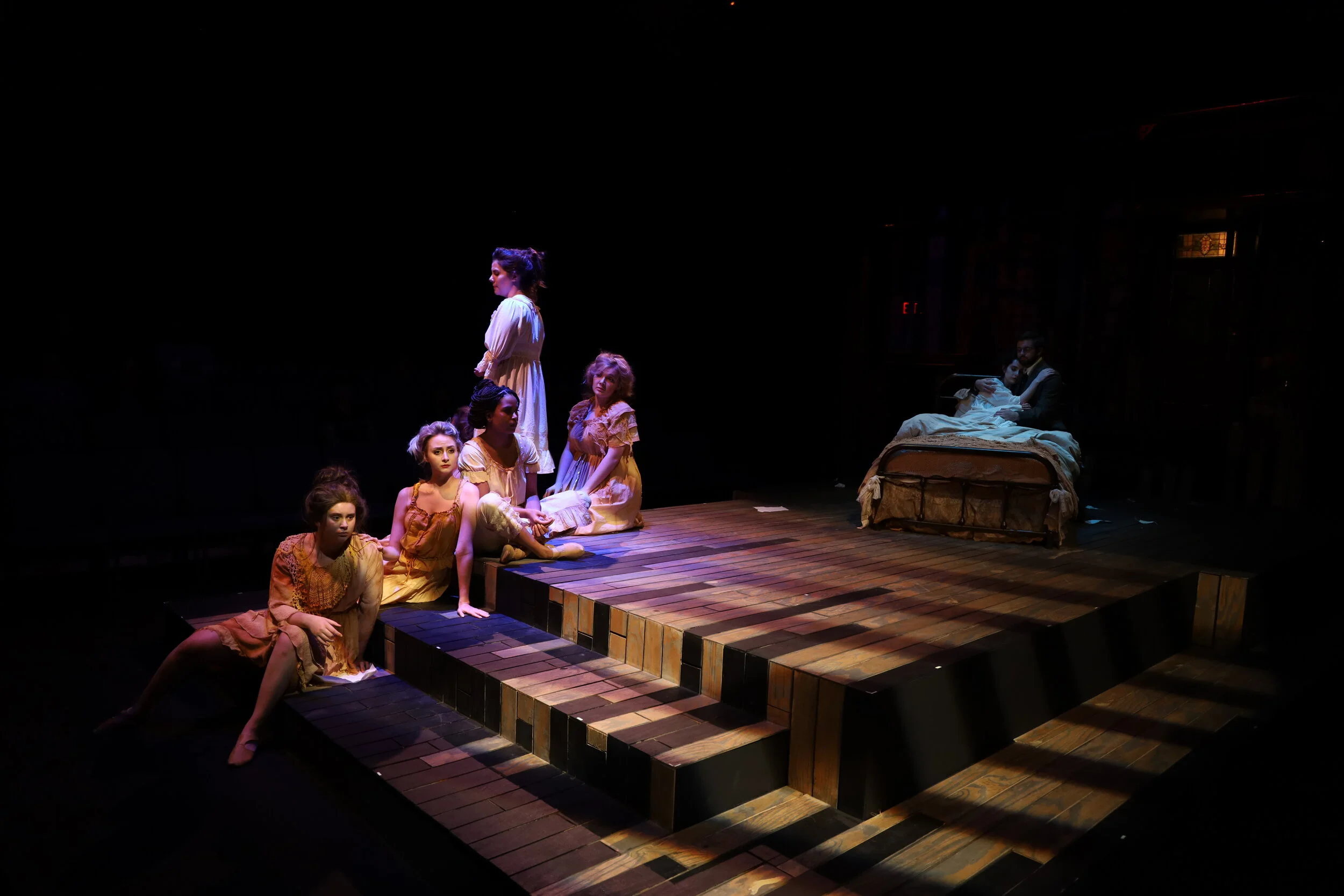
Yellow Wallpaper was my BFA thesis production at Tulane University. Adapted from the famous short story by Charlotte Perkins Gilman, this production featured 8 “Jane”’s – women who emerged from the walls, representing the repressed aspects of our heroines personality.
Using references from the original text, I based my design on mold, fungus, and decay. Each alter ego who emerges from the wall represents a more disregarded self – another identity left stagnant, to rot. Timelapse images of decaying objects informed the shapes, colors, and textures of each garment.
I applied a crafts based approach to this design. I experimented heavily with dyeing, sewing, and molding techniques in order to create looks that were intentional yet organic. Most notably, I used thermochromic pigment to turn a character’s costume yellow on stage.
As a movement-based piece, this play required certain considerations, such as rubber-soled shoes and flexible undergarments. I worked closely with the set designer, movement coach, and actors themselves to ensure maximum mobility and safety, while maintaining the integrity of the design.
Director: Jessica Podewell
Movement Directior: Jeffrey Gunshol
Playwright: Kate Bergstrom
Lighting Design: Vlad Ghinea
Scenic Design: Betsy Primes
Photography by Martin Sachs, and Cat Landrum with 2nd Story Creative
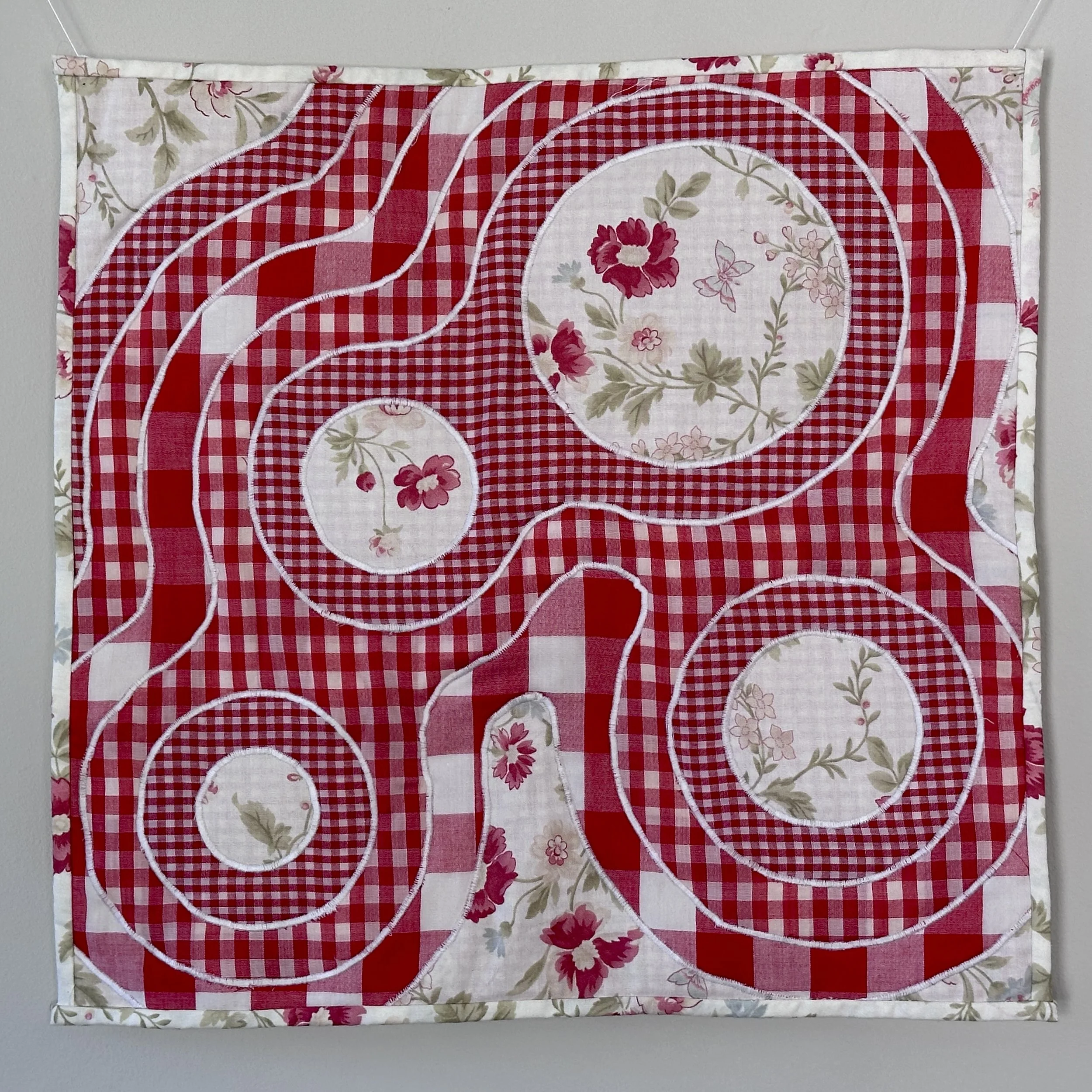
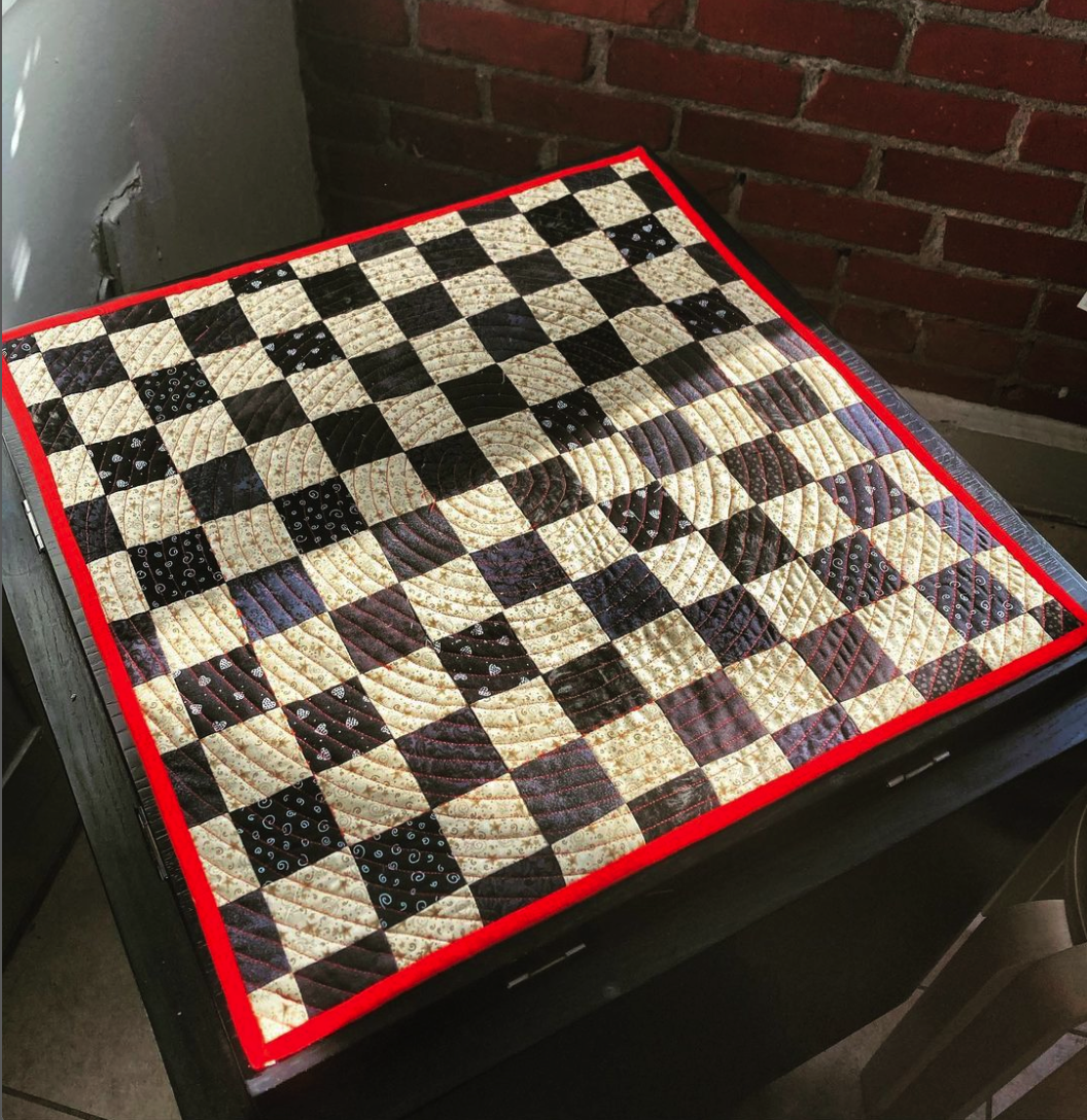
God I love gingham. When I had 3 ginghams in 3 different sizes? Heaven.
This quilt was an exploration of curved shapes, cutting away excess to reveal the layers underneath. I wanted it to feel like you were seeing into something – down into the depths – the different size squares indicating distance or thickness.
The resulting image is graphic and geometric, reminiscent of cellular division or topographical maps. By keeping the colors and patterns relatively uniform, I was able to create very “loud” patterns without them becoming overly garish.
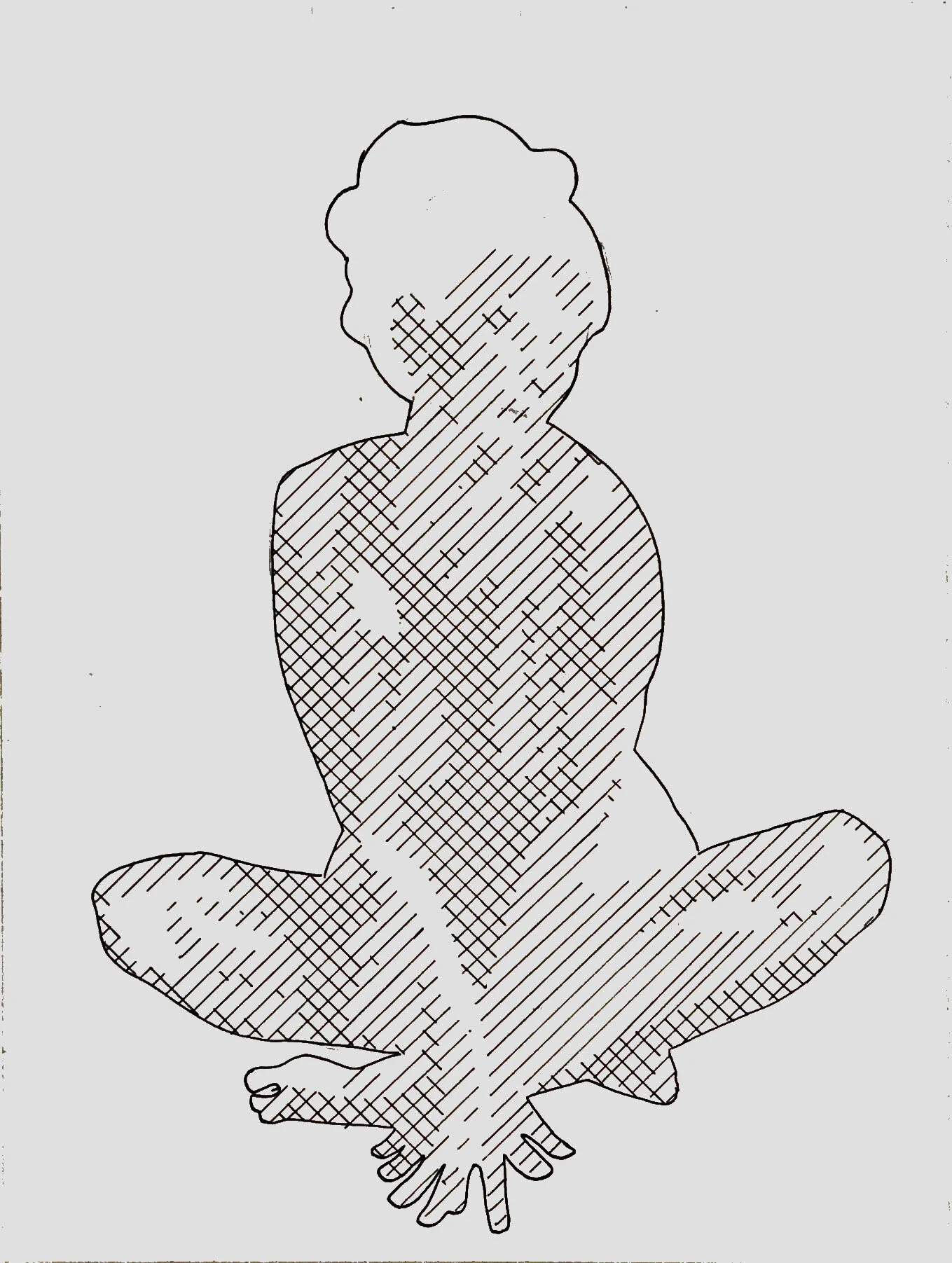
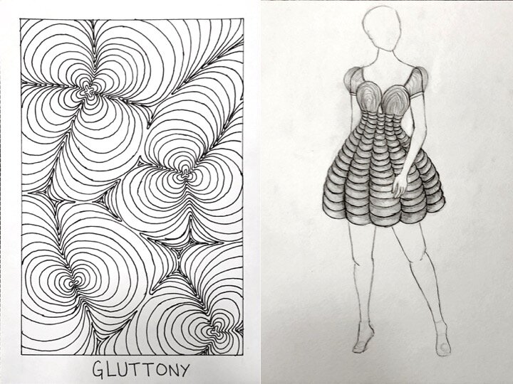
7 Deadly Sins is a paper project assigned in a Fundamentals of Design course at Tulane University.
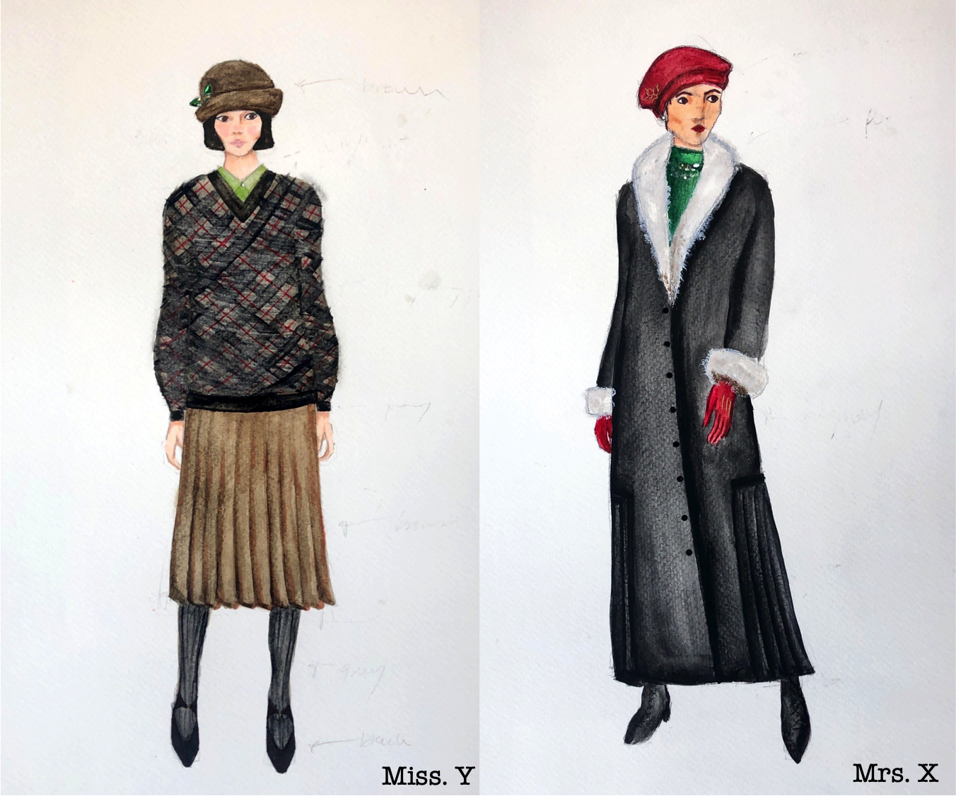
Costume design for The Stronger by August Strindberg, set in late 1920’s Paris.
A paper project for the Fundamentals of Design course at Tulane University.
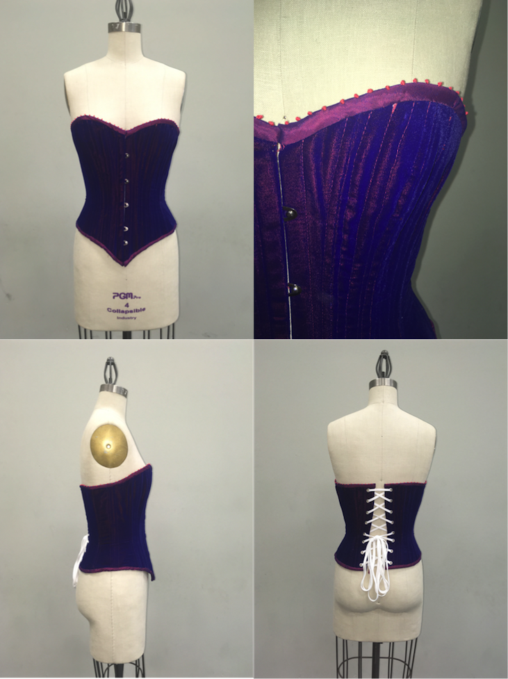
Having never made a corset before, I, of course, opted for a 16-panel late-1800’s pattern, and made it out of the ever-finicky velvet.
Was the final product as clean as I’d have liked? Not particularly. But, I did learn a lot, and every corset I made following this one was easy by comparison.
Created as part of a short course in corsetry at the Royal Academy of Dramatic Art in London.
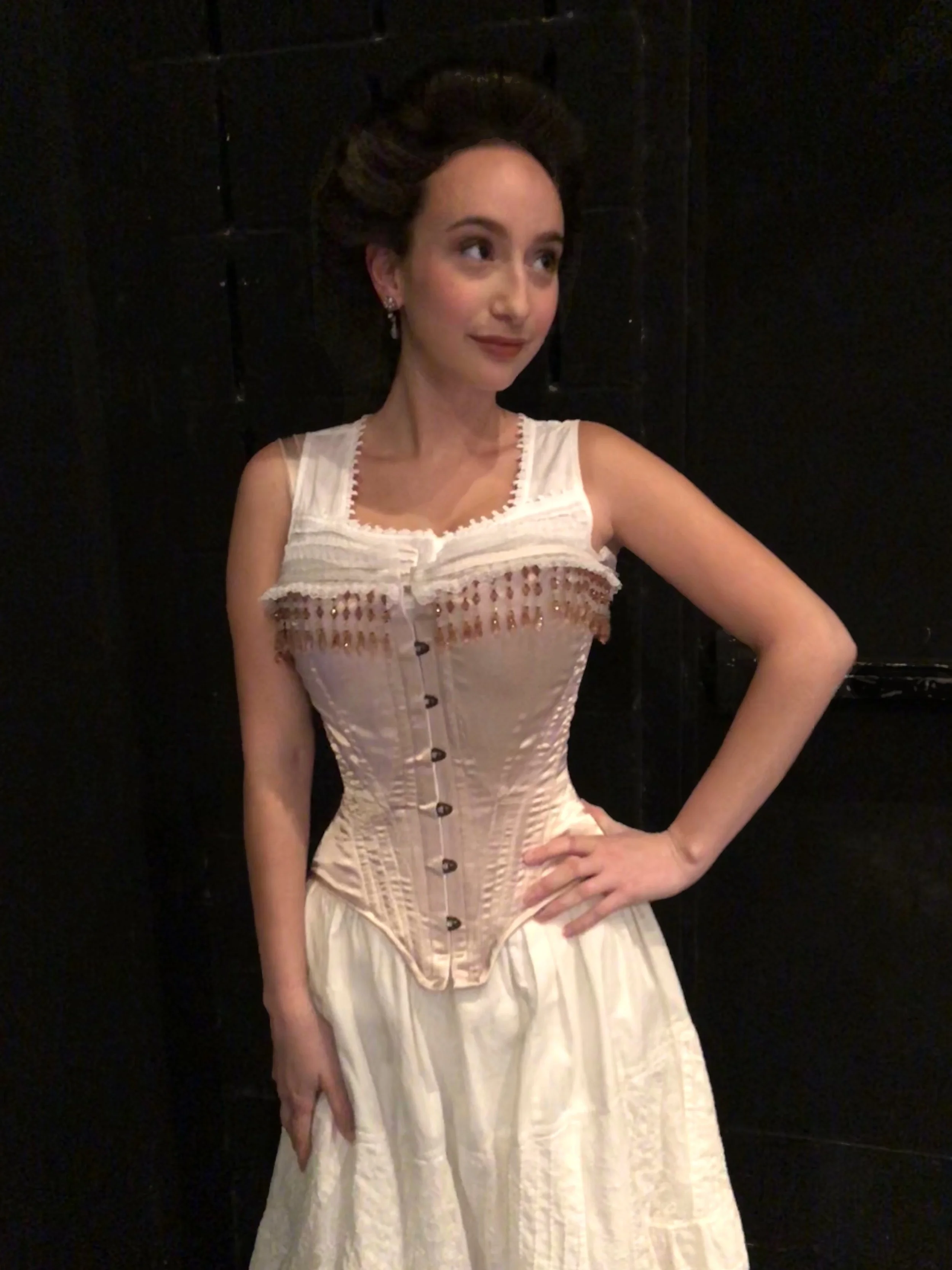
This corset was created for a production of Intimate Apparel at Tulane University.
S-Bend corsets were popular in the Edwardian Era, circa 1905. They were advertised as a healthier alternative to the more restrictive corsets of earlier eras, leading the way to the longline corset and bras of the in the 1910-20s.
The shape of the corset creates a “pigeon-breasted” silhouette, tilting the body forwards and emphasizing an S-shape when viewing the body from the side.
Costume Design by Jenn Jacobs.
Light + Shadow was a light-driven dance piece containing the work of multiple choreographers produced by the Newcomb Dance Company in March 2020 at Tulane University.
This piece presented as vignettes between other pieces, representing the odd experience of walking home at 4am in the New York City meatpacking district, with certain passerby’s on the way home, some off to work, some on a morning jog, and the odd relationships that occur.
Choreography: Leslie Scott
Lighting Design: Philip Sandström
Photography by: Sarah Danziger
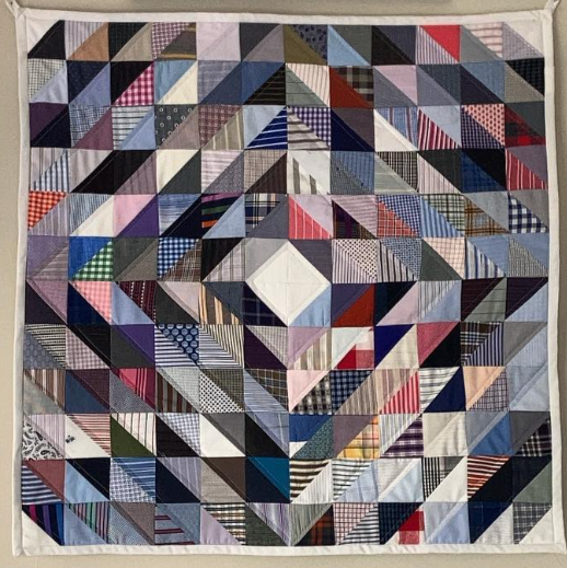
I would like to first apologize to Anto Shirt Makers in Beverly Hills for never returning their swatch book.
With one piece of each fabric, I opted for a simple pattern that didn’t rely on continuity across shapes. Each shirt fabric has it’s own character, and they work together to create a piece that has exceptional depth for the amount piecing required. By using white pieces in the corners and centers, I anchor the graphics and give the eye a place to rest.
Pattern by Aranea Black
Fliers for various events I’ve hosted around Los Angeles.
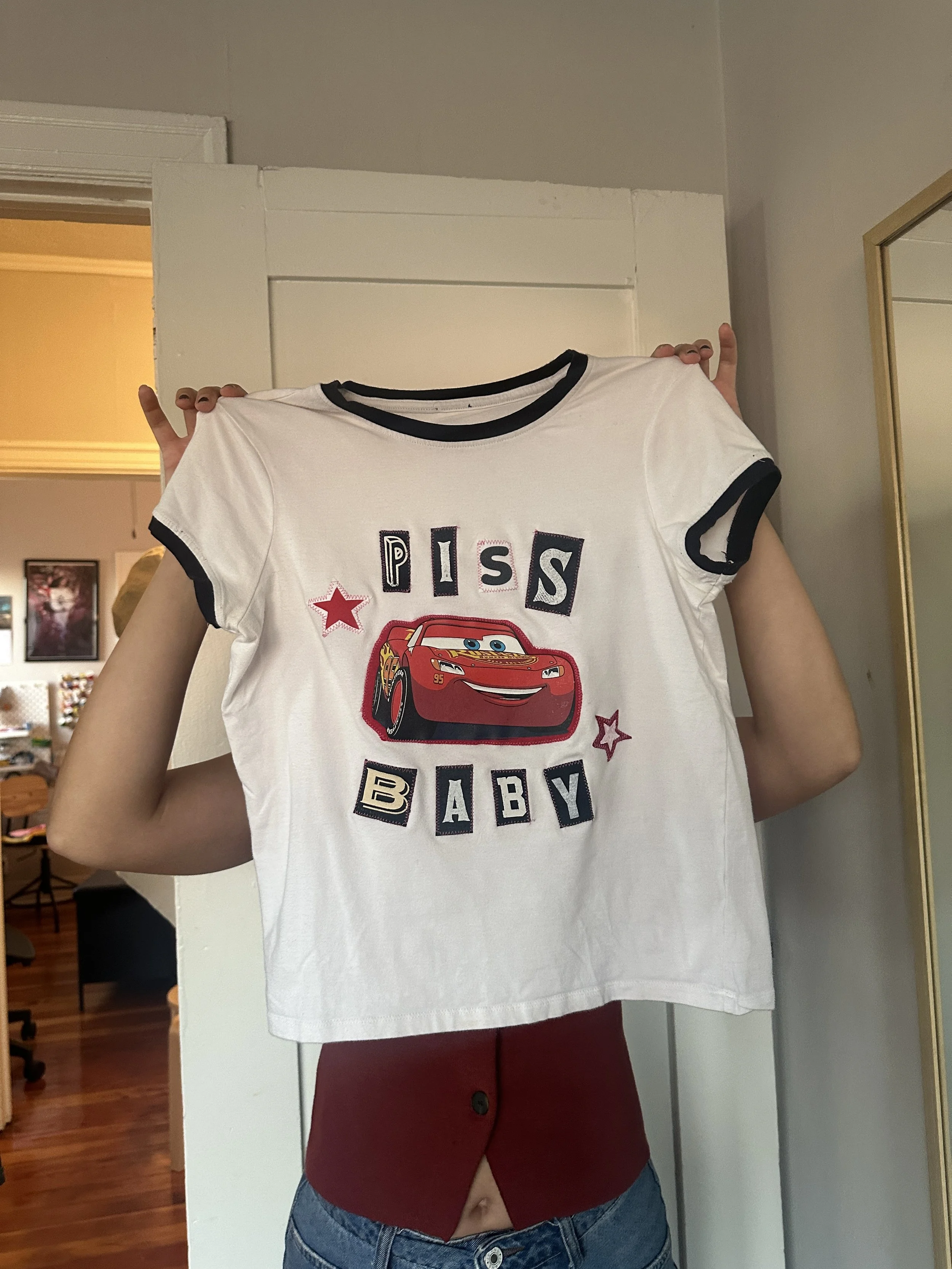
Almost every shirt that says some variation of “Appleton Wisconsin Turkey Trot 2016” eventually ends up at the Goodwill Bins, and from there ends up in massive textile landfills. Textiles are very energy and water-intensive to create, and the waste made me feel gross. So I started buying them, cutting them up, and using them to create something ridiculous and new.
So far, I’ve hosted 3 tee shirt making events, and I plan to host more in 2026!
As an apprentice at the Santa Fe Opera, I had the opportunity to design costumes for an Apprentice Scene – an excerpt from Lucia di Lammermoor. I created these looks from the SFO costumes stock, altering and embellishing to achieve my desired effect.
Directed by Paul Curran
Photography by Bob Godwin